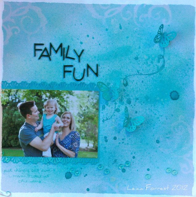
I love that this month we are doing different colour theory type layouts. I chose to show you monochromatic colours. How fun!When I wanted to do monochromatic, I thought I would have everything on the layout a different shade of turquoise blue. Everything from the paper, the title, the embellishments. EVERYTHING! For this layout I printed the photos on canvas and did the whole thing on canvas to give it a textured feel. I new I wasn’t going to be too crazy with the whole layout so I thought I’d create different elements that make it stand out in other ways.
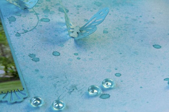
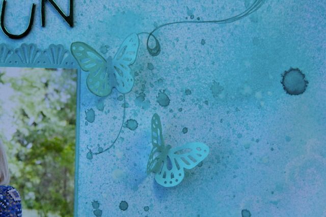
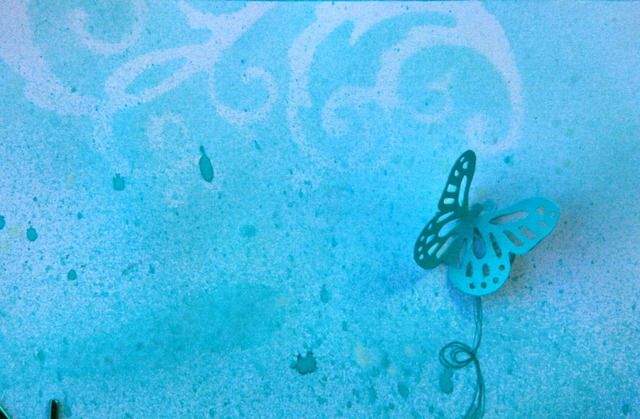
I used Patina & Turquoise Blue glimmer Mists. In a couple spots I sprayed chalkboard mist in chalk. I tried to create subtle designs like using stencils and spraying only slightly to barely make them show. I also kept my sprays short and let them drip to create some “spots”. I did spray another sheet of paper with turquoise to use as a mat for the photo and to punch the butterflies out of. All the writing was done with a turquoise marker. Here’s some closeups.
Just some fun with turquoise. By varying the light & dark of a colour, you end up with a fabulous monochromatic layout! Thanks for coming! Leica Forrest (find me on facebook)


'playing with monochromatic colours' has 1 comment
September 20, 2012 @ 7:08 am Martha
LOVE this lo and love that photo…what a happy family!